The worlds of fine art and commercial advertising might seem miles apart, one focused on creative expression, the other on driving sales. Yet, throughout history, these two spheres have unexpectedly intertwined, resulting in some memorable campaigns. In this short article, we’ll examine some of the more iconic instances where artworks have stepped into the world of advertising. We’ll take a look at the motivations, impact, and occasional controversies that arise when artistic masterpieces are used for commercial ends.
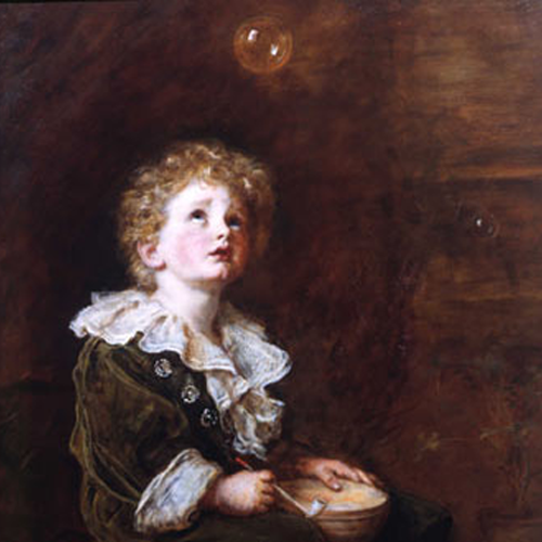
One early instance involves Sir John Everett Millais’s 1886 painting, Bubbles, originally titled A Child’s World. This work depicts Millais’s five-year-old grandson with a soap bubble. The bubble in art has a conventional meaning, connoting innocent pleasure, while also acting as a reminder of the fleeting nature of life. It is the skull’s cheerful twin in conventional vanitas symbolism. This morbid subtlety did not prevent Thomas J. Barratt, the managing director of A & F Pears, from seeing the potential for this image in advertising. Barratt purchased the original painting for £2,200, and this included the exclusive copyright to the picture. With Millais’s permission, a bar of Pears Soap was added to the painting for promotional purposes. Bubbles is often considered to be one of the first examples of a fine art painting used in a widespread advertising campaign. The advertisement aimed to link Pears Soap with the themes of purity and youthful innocence present in the artwork. This use of a painting for commercial purposes did attract some criticism at the time, with the novelist Marie Corelli accusing Millais of compromising his artistic principles. In her 1895 novel The Sorrows of Satan, one of her characters says: “I am one of those who think the fame of Millais as an artist was marred when he degraded himself to the level of painting the little green boy blowing bubbles of Pears’ soap.” Nevertheless, the campaign was so successful that today the association is part of the soap brand’s storied history.
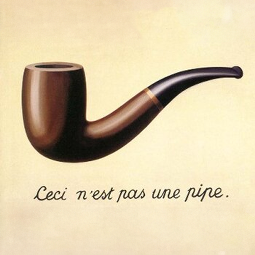
Moving on, there’s René Magritte’s 1929 painting, The Treachery of Images, often known as Ceci n’est pas une pipe. This Surrealist work features a detailed depiction of a pipe accompanied by the statement – in French: “This is not a pipe,” which prompts viewers to consider the difference between an object and its representation. As with the previous example, some artistic subtlety was lost when the German financial services company Allianz Insurance adopted Magritte’s style and central concept for a series of four ads. These used imagery reminiscent of Magritte’s work along with taglines such as “This is not a roof. / This is a painful bump provocateur”. The intention was to draw a parallel between familiar objects and potential unseen risks, thereby promoting the protective function of insurance. This approach aimed to engage viewers intellectually by referencing a well-known artwork. It’s worth noting that Magritte himself had previous experience in the advertising industry.
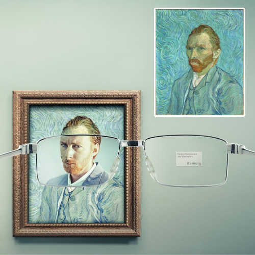
Another example is the use of Vincent van Gogh’s self-portraits, specifically his Self-Portrait of 1889, in an advertisement by the French spectacle retailer KelOptic. The campaign featured this self-portrait, along with works by Monet and Seurat, visually transitioning into sharp detail as if viewed through spectacles. The tagline, “turning impressionism into hyperrealism,” linked the perceived blurriness of Impressionism with the clear vision offered by KelOptic’s products. The choice of Van Gogh, an artist who experienced visual distortions, added another layer of meaning to the advertisement for vision correction.
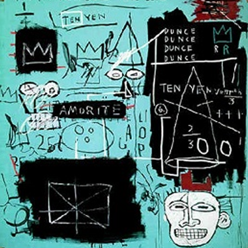
In more contemporary times, Jean-Michel Basquiat’s 1982 painting, Equals Pi, was featured in Tiffany & Co.’s “About Love” campaign. This vibrant work includes Basquiat’s characteristic crown motif, a distinctive head, and cryptic text. The painting also features a significant amount of robin egg blue, a colour strongly associated with Tiffany & Co.. Tiffany’s acquired the painting in 2021 and featured it prominently in their advertising, including appearances by figures like Beyoncé and Jay-Z. This was a deliberate effort to associate the luxury brand with Basquiat’s artistic legacy and contemporary relevance, and the use of Tiffany’s iconic colour in the artwork aimed to strengthen brand recognition and appeal to a younger audience. This use of Basquiat’s work did draw some criticism. Notably, Stephen Torton, who worked as Basquiat’s studio assistant and helped prepare many of his canvases commented that the idea was “so absurd” and a “very perverse appropriation of the artist’s inspiration.”
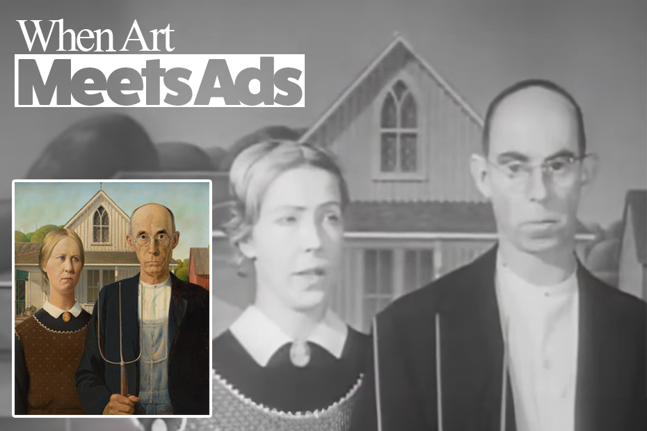
For an even more perverse appropriation, we can turn to Grant Wood’s iconic 1930 painting, American Gothic. This moody masterpiece was incorporated into a black-and-white advertisement for General Mills’ “New Country Corn Flakes” in 1966. This painting of a farmer and a woman in front of a distinctive house in Iowa, has become a well-recognised image of American identity. By using American Gothic, General Mills likely intended to tap into the painting’s cultural symbolism, evoking feelings of nostalgia, wholesomeness, and traditional American values in association with their breakfast cereal. The enduring recognition of the artwork allowed it to be effectively used commercially decades after its creation.

These examples illustrate various ways in which art has been used in advertising. Advertisers might turn to art to capture attention, enhance brand image by associating with sophistication, evoke emotions, stand out in a crowded market, and leverage the cultural recognition of established artworks. However, this practice also raises ethical considerations about the appropriateness of commercialising art and potentially diluting the original intentions of the artists. The effectiveness of such campaigns often depends on the connection between the artwork’s inherent meaning and the brand’s message.
As this brief canter through some one the most famous appropriations of art for advertising implies, the relationship between art and advertising has evolved over time. Early advertising, while not initially considered art, drove innovations in printing and visual appeal. The late 19th century saw the rise of the “artistic poster” movement. Later periods witnessed the influence of movements like Art Nouveau, Art Deco, and Surrealism on advertising design. More recent examples in the UK include Ridley Scott’s 1984 commercial for Apple, drawing on George Orwell’s novel, and Jonathan Glazer’s Surfer for Guinness, inspired by Walter Crane’s 1892 painting of Neptune’s Horses. These examples demonstrate how literature and visual art have been used to create memorable and impactful ads. The motivations for this include engaging audiences, enhancing brand perception, forging emotional connections, and achieving a unique identity in a competitive market. While such creative approaches are often creative, funny and engaging, there can also be concerns about accessibility, the focus on art overshadowing the product, and the ethics of appropriation.
The examples explored here, spanning a century, demonstrate that the creative tension between art and advertising is far from a fleeting trend. As marketing continues to evolve in an increasingly visually saturated world, the temptation to harness the evocative power of established artworks will likely persist. Whether these collaborations are seen as ingenious strategies or controversial appropriations, they undeniably force us to confront the evolving role of art in popular culture and the ever-blurring lines between creative expression and commercial persuasion.

Benedict is Vieunite’s Cultural Director and a lecturer at Nottingham Trent University.